Details
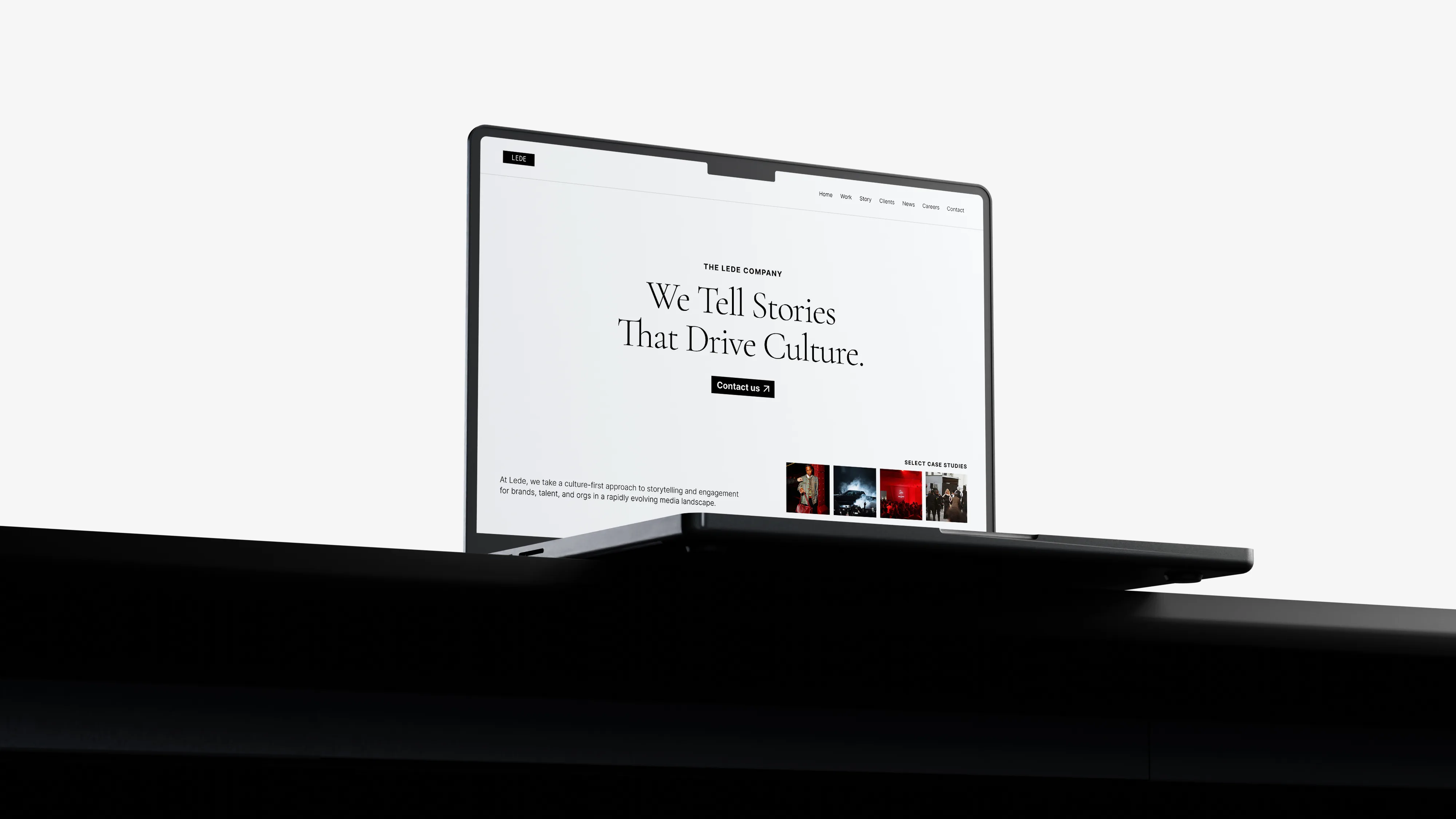
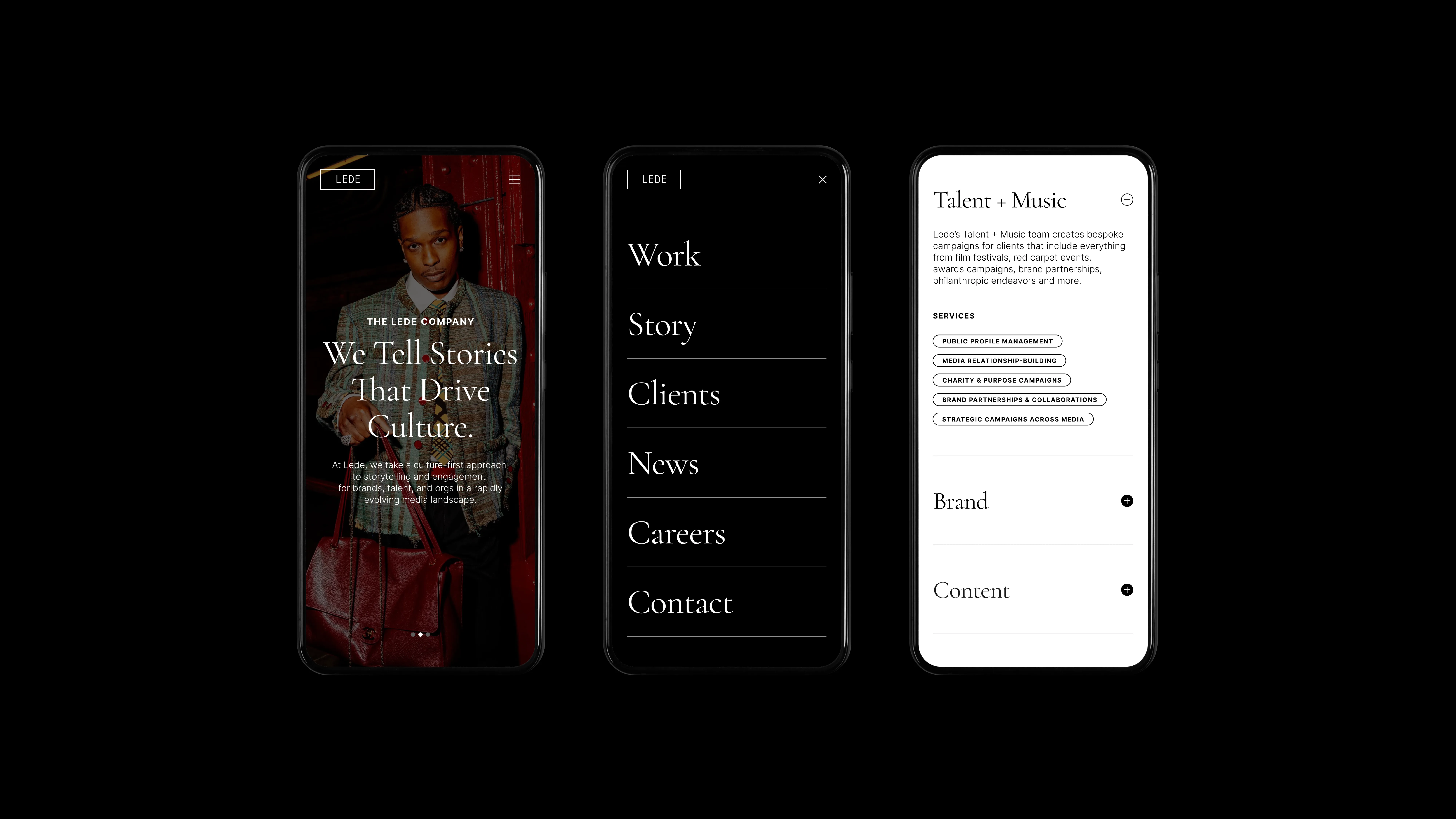
Refreshed brand identity alongside a complete site redesign for Lede. The process spanned low-fidelity wireframes through hi-fidelity design created in Figma, carrying all the way through into development.
Role
Art Director, UX Designer
Problems
Lede's site no longer reflected their brand or the caliber of their work.
- Dated design didn't match their evolved brand identity
- Site didn't clearly communicate offerings
- Lack of consistency and design systems used throughout
- Site didn't showcase client work in a way that felt premium
Solutions
Restructured content hierarchy and created an elevated visual system, prioritizing client work while carrying their new editorial and modern brand identity across every page.
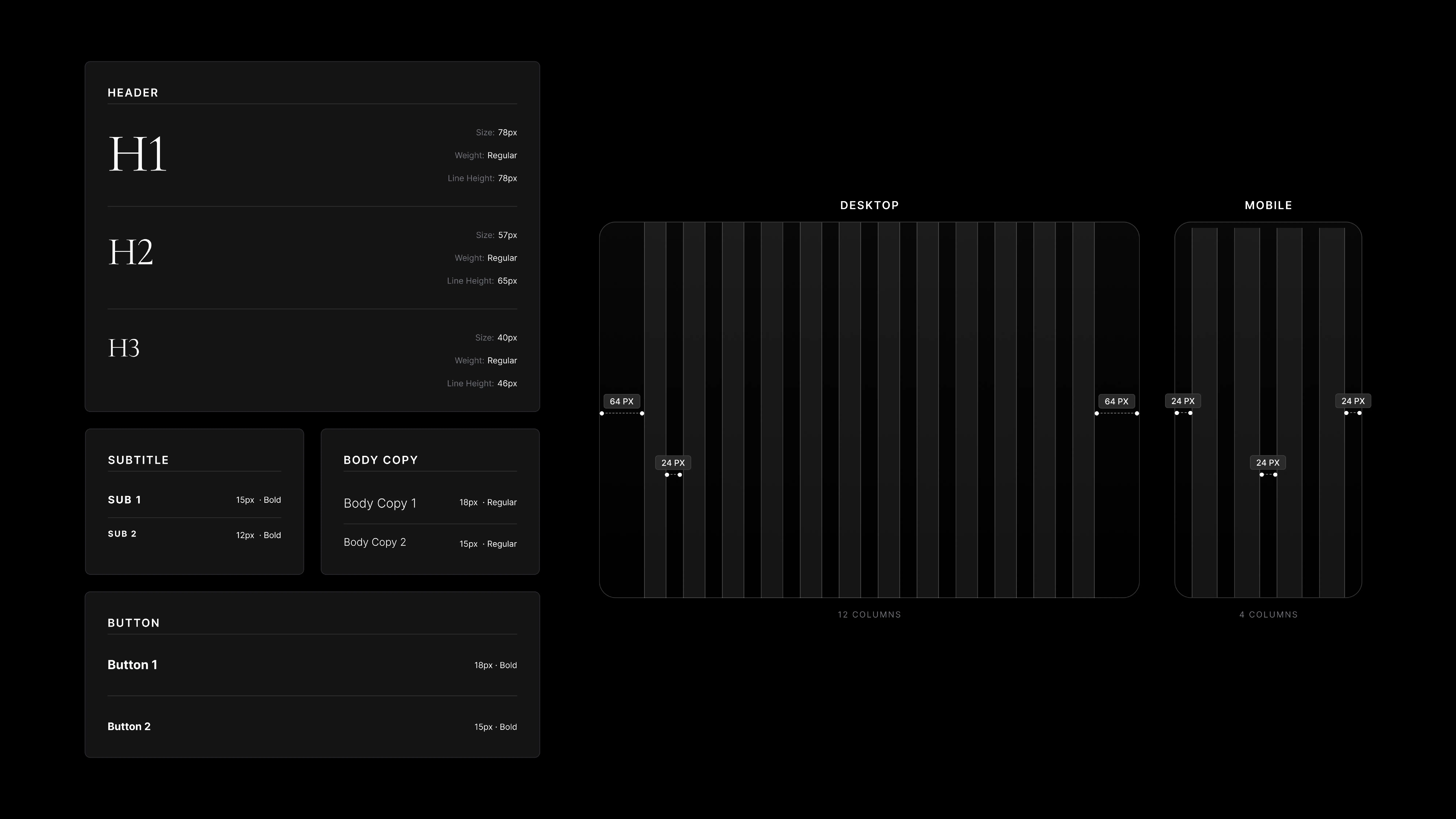
- Introduced a serif font as the brand's primary typeface, chosen for its high-contrast, elegant letterforms that add personality and an editorial edge without feeling too heavy
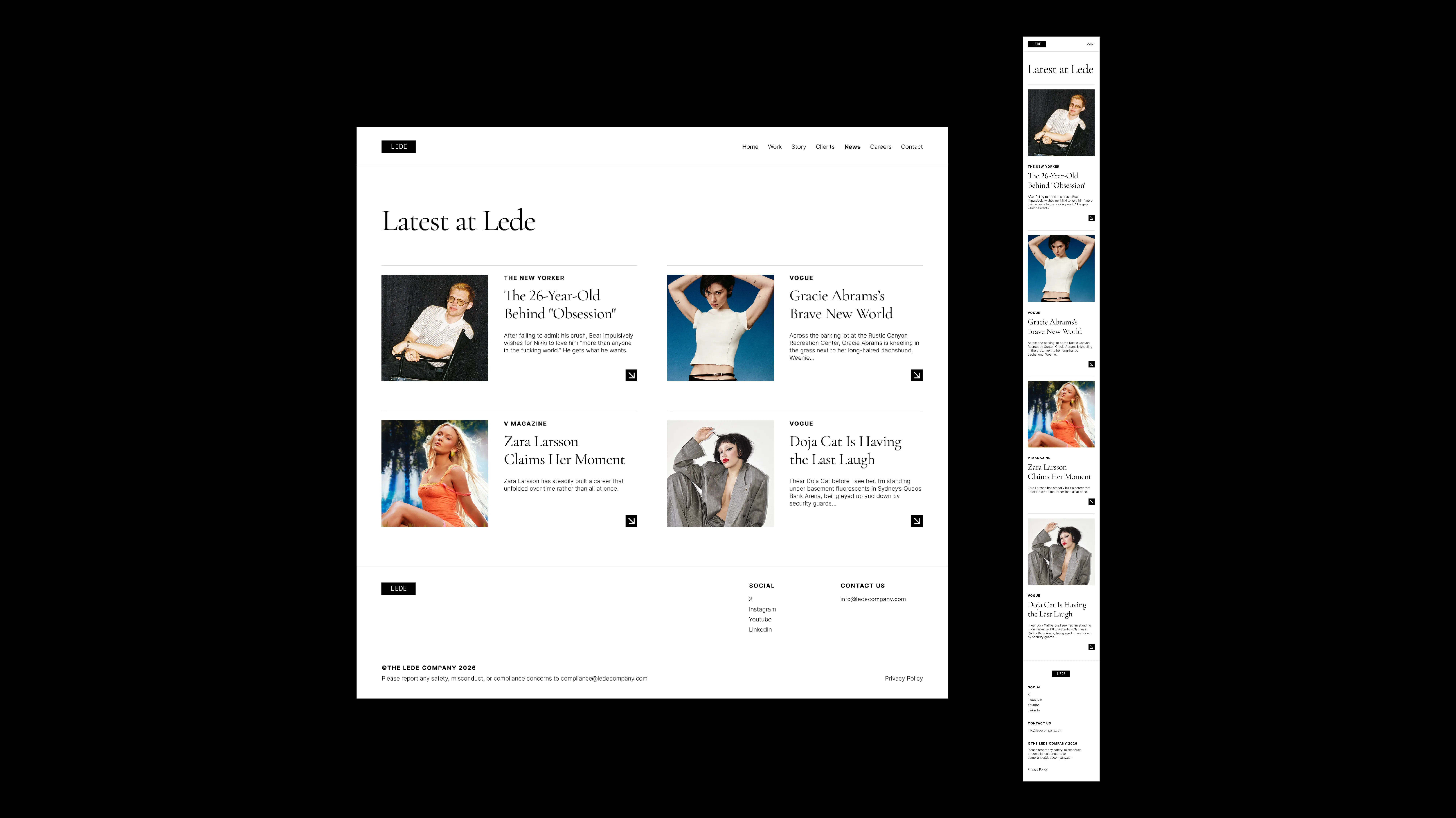
- Let client imagery lead, showcasing their work at full strength
- Ample white space for a light and airy editorial feel, black accents for high impact
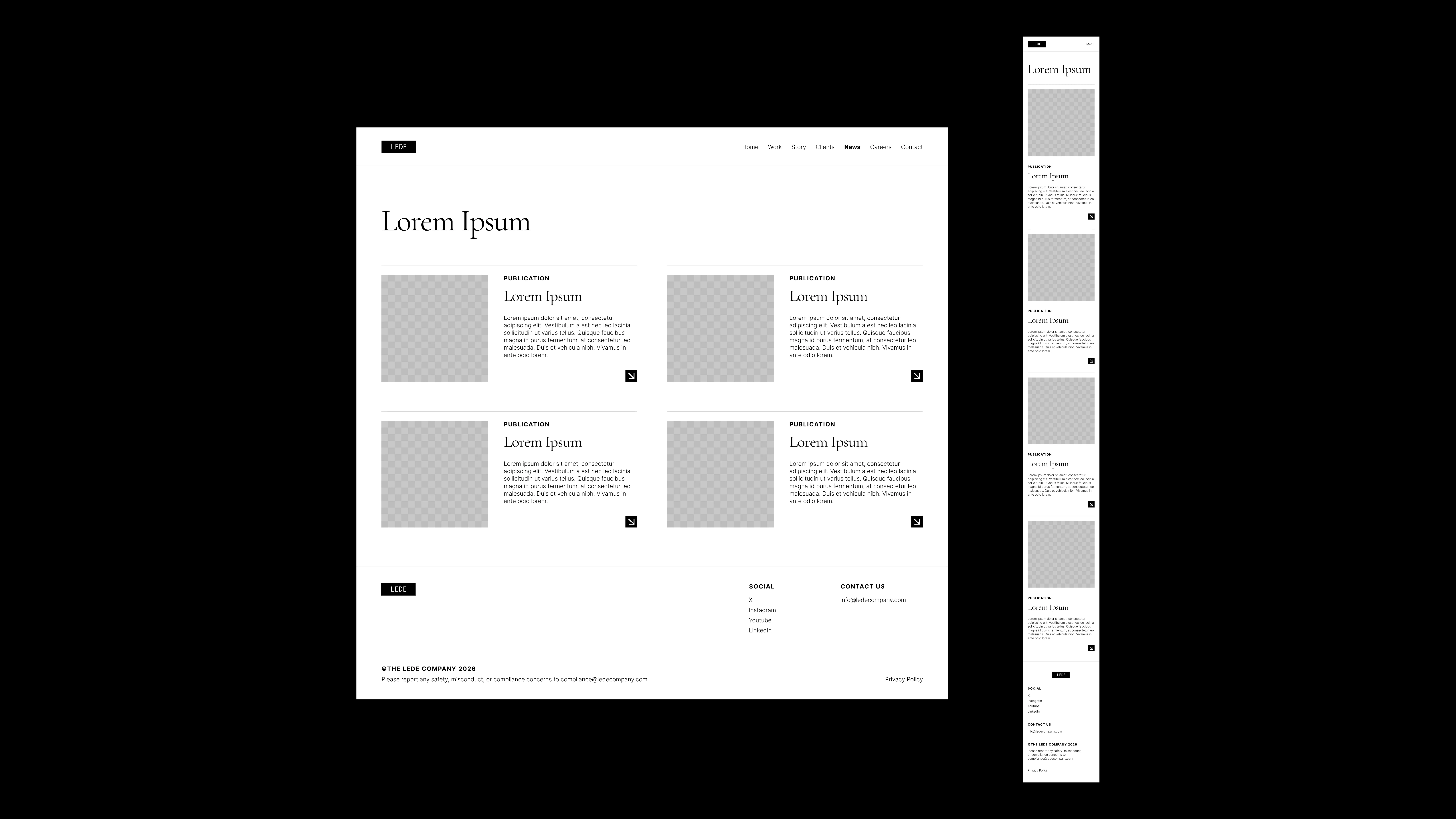
- Established a design system with defined type hierarchies, spacing, and interaction patterns, creating a scalable, consistent foundation
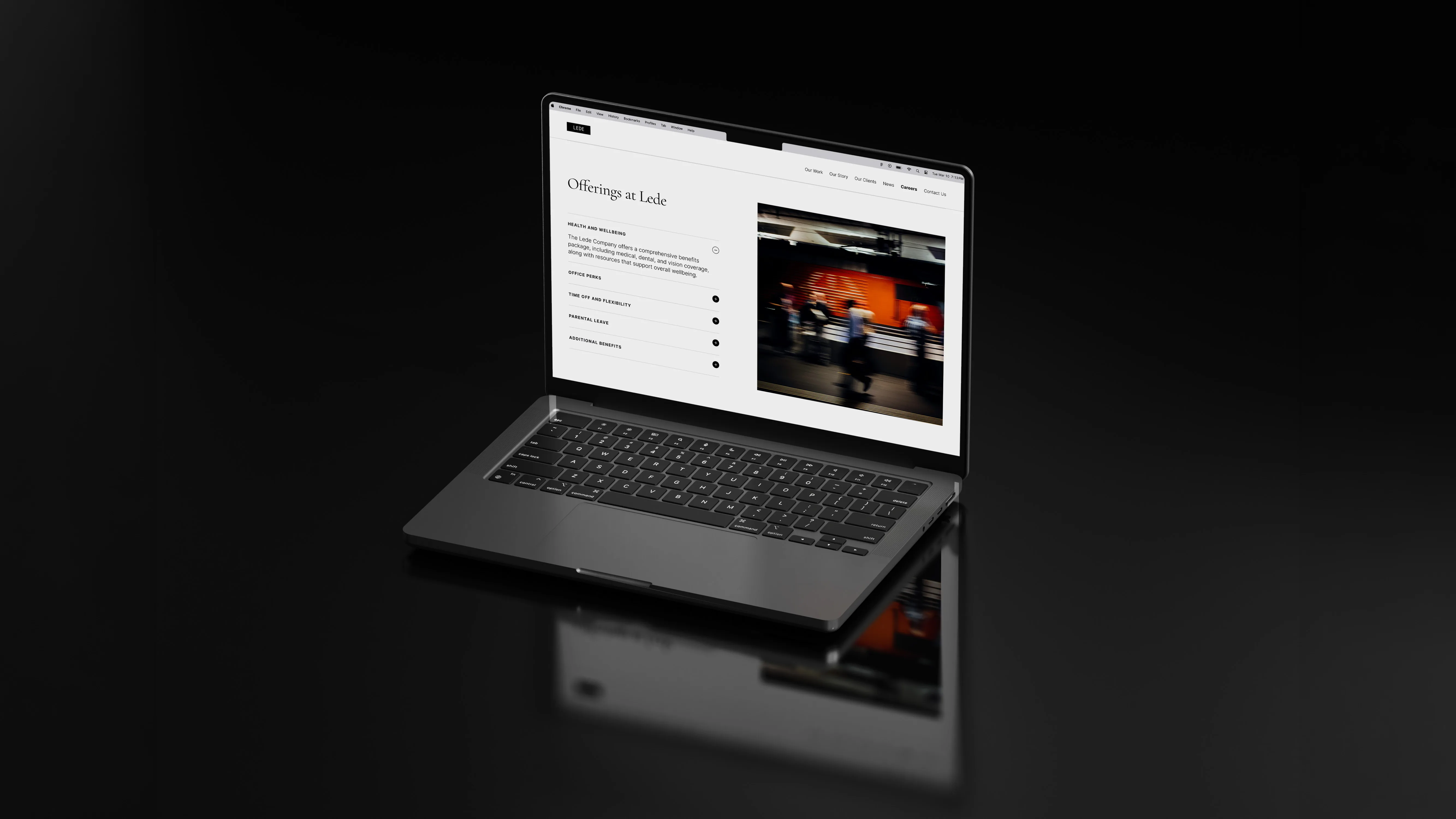
- Restructured the site's content organization
 Nora
Allison
Nora
Allison

